Branding · Visual Identity
Sospiro
Fragrance house · Italy · 2024
Sospiro is a niche Italian luxury fragrance house that frames perfume as an art form inspired by classical music and opera — oils sourced in Italy, composed in France by master perfumers. Its essence is ‘Perfume, Performed’: theatrical, opulent, refined.
What we did
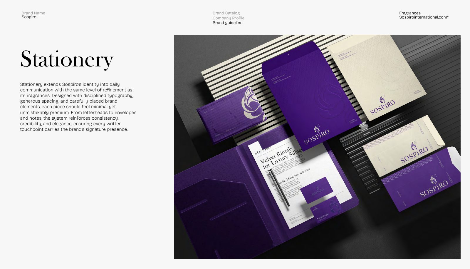
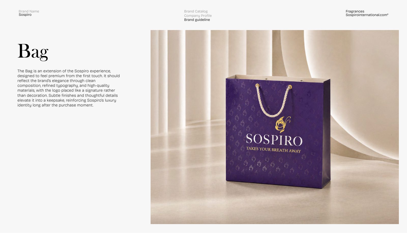
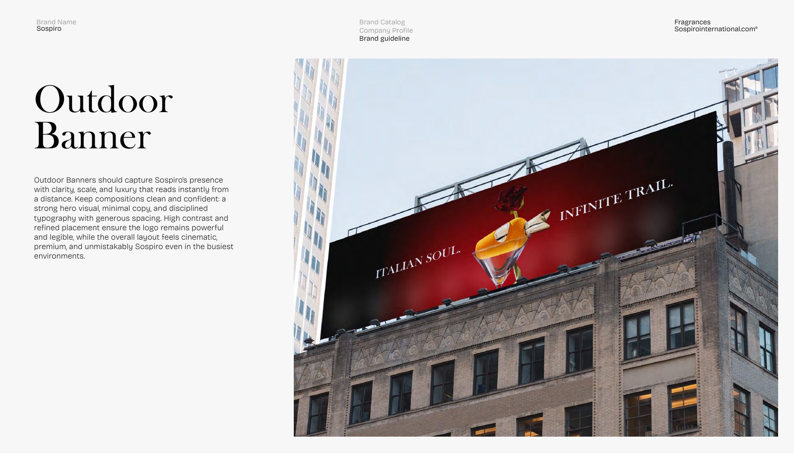
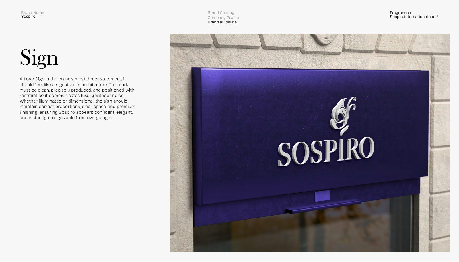
We delivered Sospiro's full brand identity and guideline — an emblem-and-wordmark logo with variations and usage rules, the colour palette, typography, a signature monogram pattern and photography direction — then applied it across stationery, retail packaging, signage and outdoor advertising.
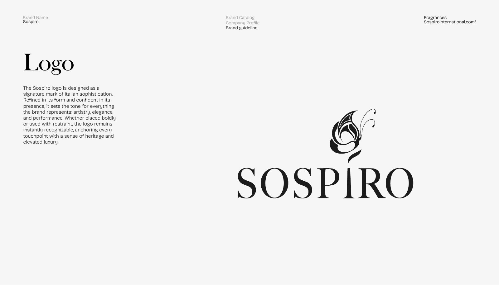
- Logo: an ornate calligraphic emblem (a flourishing plume/scroll monogram) paired with a refined serif ‘SOSPIRO’ wordmark, styled as an Italian signature mark.
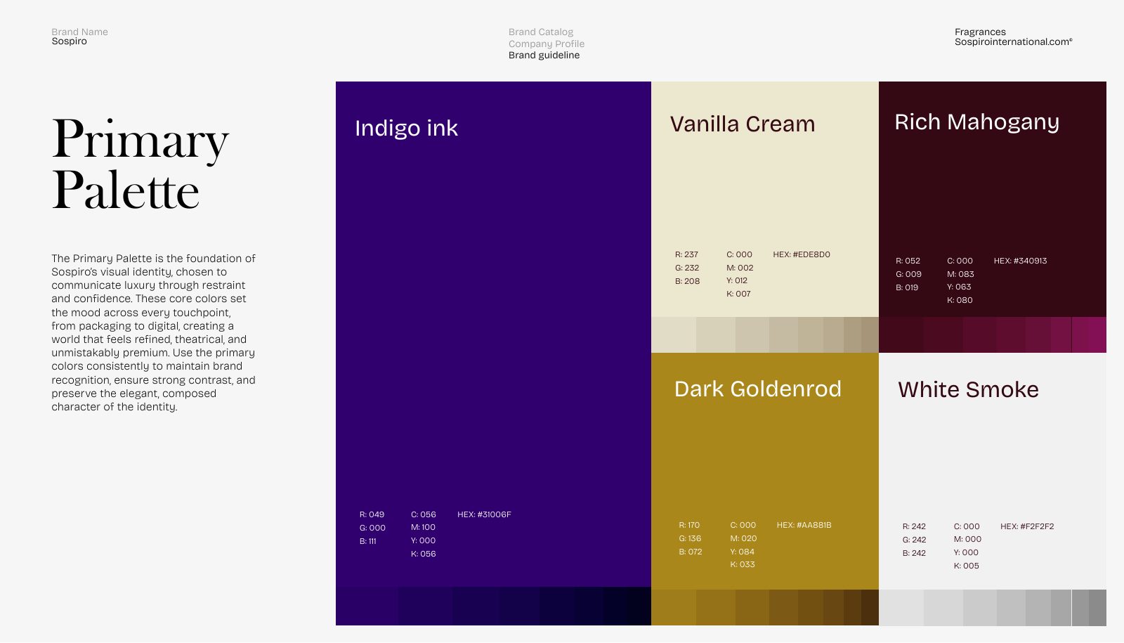
- Colour system: Indigo Ink #31006F (the signature deep violet), Vanilla Cream #EDE8D0, Rich Mahogany #340913, Dark Goldenrod #AA881B and White Smoke #F2F2F2.
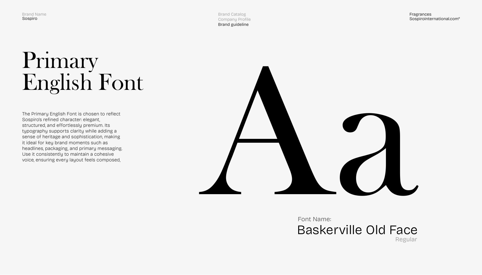
- Typography: Baskerville Old Face (primary serif) with Inter Medium as the secondary sans for body and functional text.
- Signature motif: the emblem repeated as a subtle tonal monogram pattern across packaging and stationery.
- Applications: a gold-on-violet retail bag, a purple/cream stationery suite, dimensional architectural signage and a cinematic outdoor billboard.
The identity
This is one department of the work. Want an identity built like this?
Start a branding project